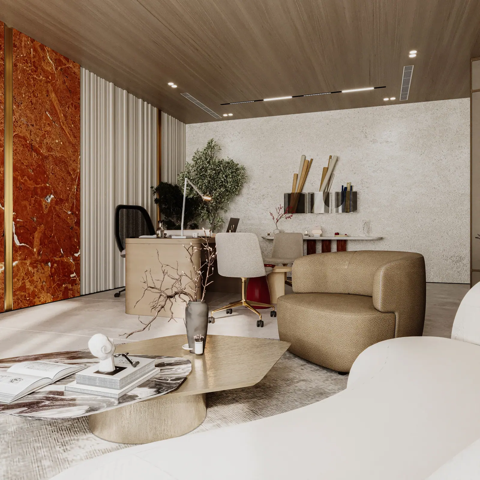
Warm interiors fail in one of two ways: everything is beige and nothing is warm, or everything is warm and nothing rests. These four rules keep a palette rich without letting it tire the eye.
1. Let one colour lead
A room can hold one strong, saturated colour comfortably: a deep red wall, a green stone, a rust velvet. Two strong colours compete. The familiar decorator's split of roughly 60% main tone, 30% secondary and 10% accent is a useful starting point, as long as the 10% is the one you remember.
2. Give warm colours something cool to sit against
Warmth is relative. A terracotta wall next to a cream wall reads as orange; the same terracotta next to a grey-green stone reads as warm and deep. One cool neutral, a stone, a metal or a pale grey plaster, makes every warm tone around it richer.
3. Use material, not only paint
Timber, stone, leather and brass carry colour with texture, which is why a warm palette built from materials feels calm while the same colours in flat paint can feel loud. Where a colour can come from a material, we let it.
4. Test under the real light
Most homes are lit with warm lamps between 2700 K and 3000 K. They push every colour towards yellow and red. A sample that looks perfect in a showroom under cool light can turn muddy at night at home. We check every palette in daylight and under the specified lamps, at the same four times of day as the architecture.
- One leading colour, used generously.
- One cool neutral to sharpen it.
- Colour from materials wherever possible.
- Approval only after a night-time check.
Written by the FLKR studio in Cairo. Published .